Carousel
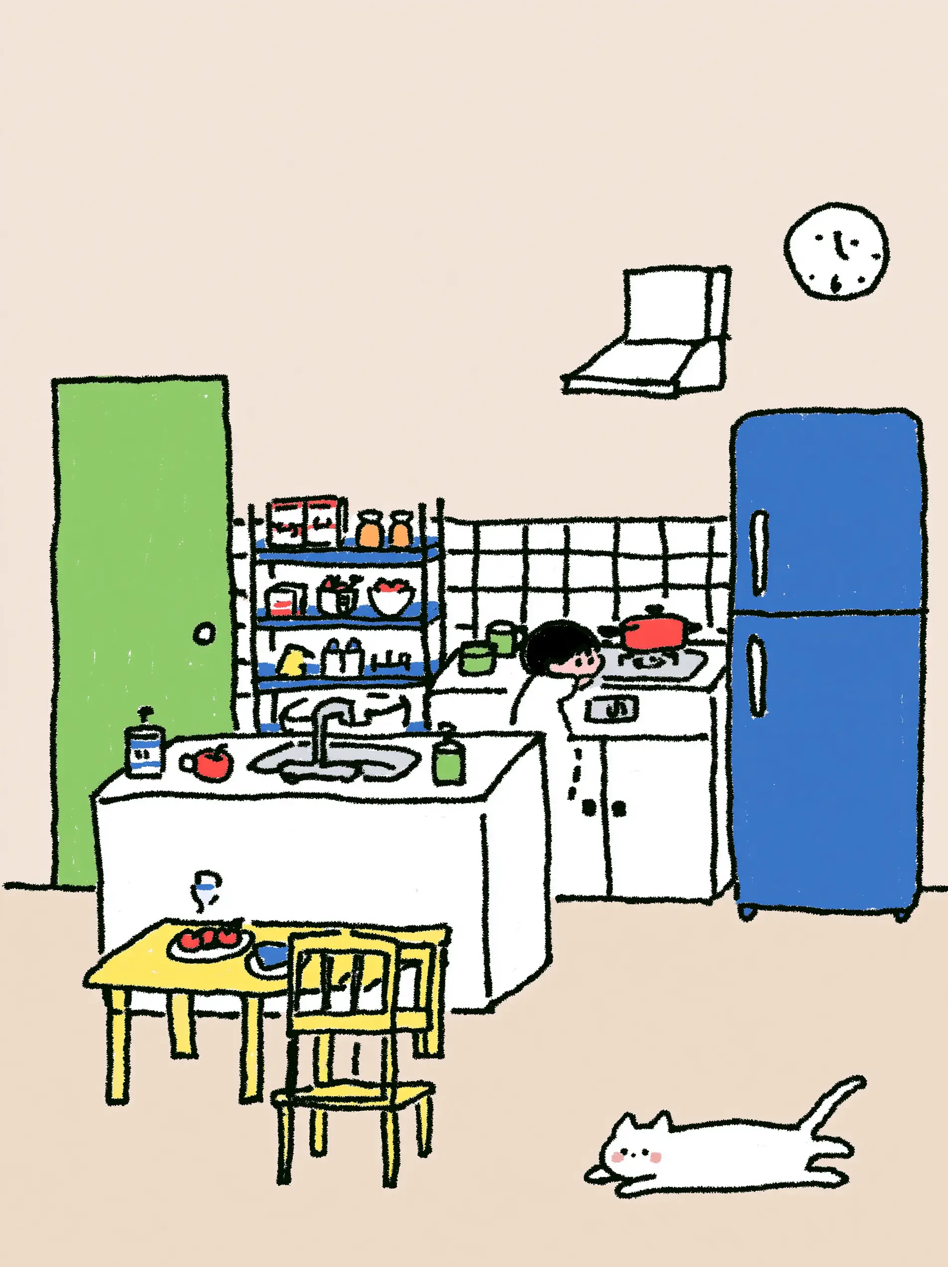
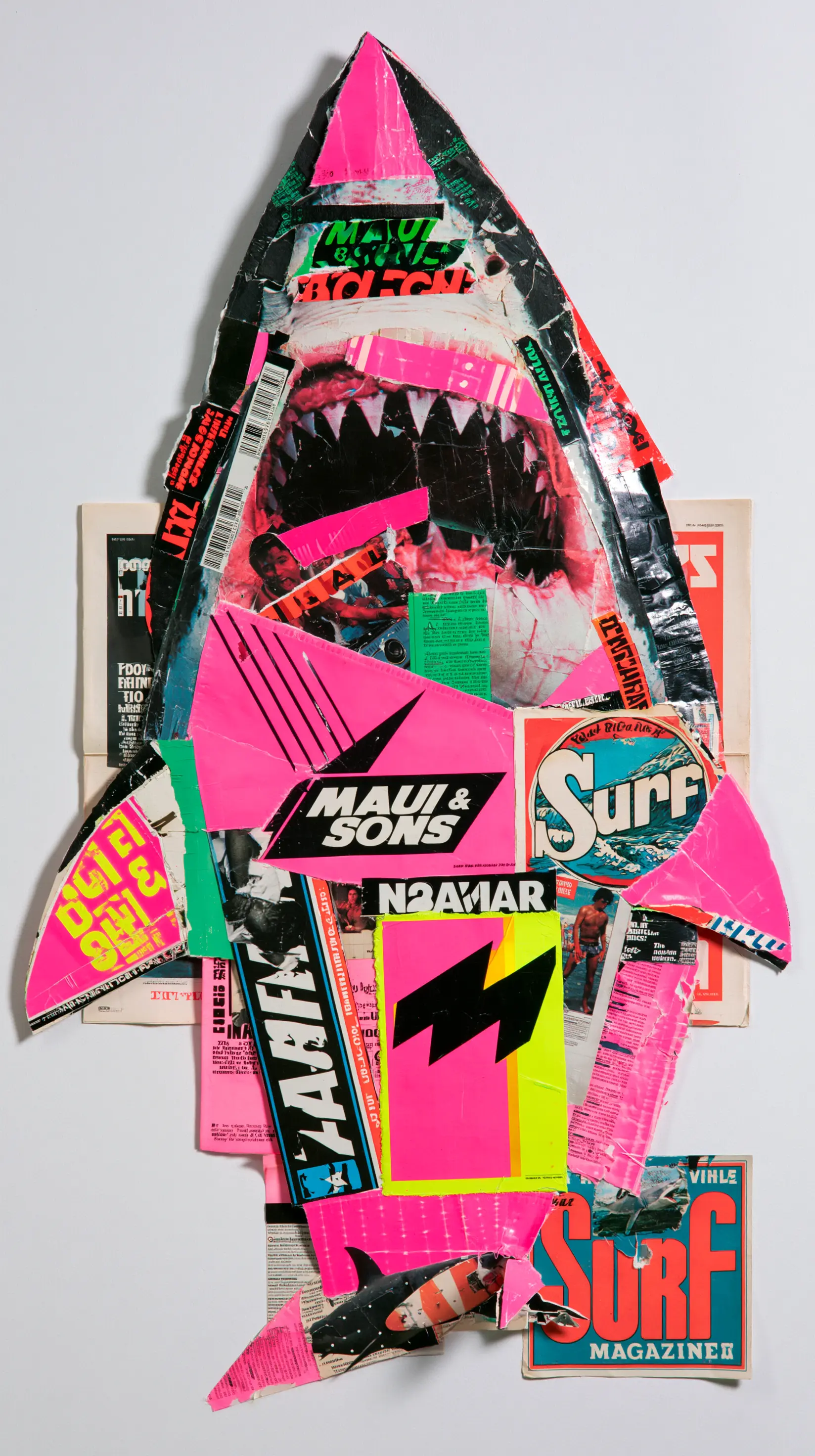
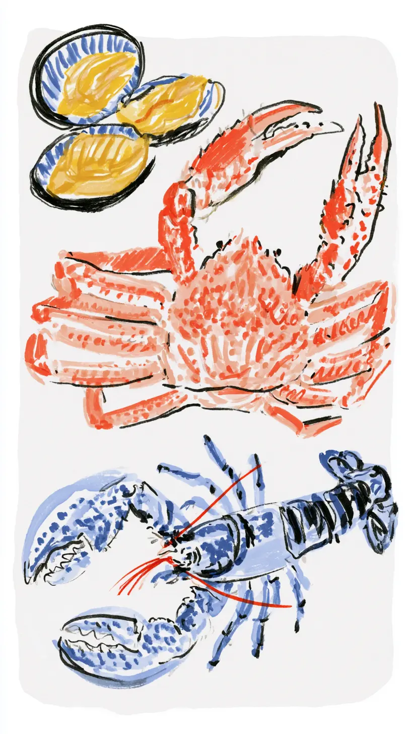
A gallery you slide through, one card at a time. Built on native scrolling with CSS scroll-snap, so touch swipe, trackpad gestures and keyboard scrolling all work on their own; the arrows and the position indicator are the only parts that need JavaScript.




Installation
You can add this carousel using our CLI or manually:
Dark mode ready - this component follows BoardUI semantic tokens automatically. Set up theme switching.
The CLI copies the component source (with its internal dependencies) into your project and installs any required npm packages.
npx boardui@latest add carouselUsing a shared UI package or custom import aliases? Configure your installation paths before running the CLI. Copy-paste examples use the default imports.
Card widths
Each item fills the track by default, so exactly one card is in view per slide. Width lives on CarouselItem rather than on the track, so overriding it gives a peek of the next card or a run of mixed widths. Positions are read back from the DOM rather than calculated from a fixed card width, so nothing needs telling when those widths change.
{/* One card per slide is the default: items fill the track */}<CarouselItem>…</CarouselItem>
{/* Override to show a peek of the next card, or to mix widths */}<CarouselItem className="w-[85%]">…</CarouselItem><CarouselItem className="w-[220px]">…</CarouselItem>
Alignment and controls
align="center" rests each card in the middle of the track instead of the left edge, which suits a gallery with one hero card in view. showArrows and showDots strip the chrome back to a bare swipeable track, and gap sets the spacing in pixels.
{/* Snap each card to the middle of the track */}<Carousel aria-label="Gallery" align="center" gap={24}>…</Carousel>
{/* Bare track: no arrows, no dots, swipe only */}<Carousel aria-label="Logos" showArrows={false} showDots={false}>…</Carousel>
Accessibility
The region announces itself as a carousel and takes its name from aria-label, which is required. Each card is labelled with its position, so a screen reader reads "3 of 7" without you numbering anything. The track is focusable, so the arrow keys scroll it, and the prev/next buttons disable at the ends rather than silently doing nothing. Sliding respects prefers-reduced-motion, jumping instead of animating.